In Notebooks 01 and 02 you learned to store, load, and automate work on data. The very next thing any researcher does with a fresh dataset is look at it. A good figure does in one glance what a table of numbers cannot: it reveals trends, exposes outliers, and makes a finding convincing to other people.
This notebook builds your visualization toolkit from the ground up, always with research data in mind. We will start with matplotlib (the foundation every other Python plotting library is built on), then layer on seaborn (faster, prettier statistical plots), and finish with a peek at interactive Plotly. Along the way we build the specific figures this course needs — time series of joint angles, distributions across conditions, and the ethogram, the behavioural biologist’s timeline of what an animal is doing, moment to moment.
By the end you will be able to choose the right plot for a question, make it clear and honest, and save it at a quality you can drop into a report.
How to Use This Notebook Well
Run every cell yourself, top to bottom — the dataset built in Section 0 is reused everywhere.
For each plot, ask what question does this answer? before reading the code.
Change things. Swap a column, change a colour, add a title. Plots are the most rewarding place to experiment because you see the result instantly.
Mini Challenges and Checkpoints are for you to attempt before moving on.
We will lean on matplotlib first (Sections 1–2), treat seaborn as a faster layer on top (Section 3), and only peek at Plotly at the end (4.3). That way you are never juggling three libraries at once.
Section 0: Setup & Our Dataset
First the usual interpreter check and our imports. The three plotting libraries we use:
matplotlib — the foundation. We import its
pyplotmodule asplt(the universal convention).seaborn (
sns) — statistical plots built on top of matplotlib.plotly express (
px) — interactive plots, used briefly in 4.3.
import sys
print("Interpreter:", sys.executable)
print("Python     :", sys.version.split()[0])

import numpy as np
import pandas as pd
import matplotlib.pyplot as plt
import seaborn as sns

print("numpy     :", np.__version__)
print("pandas    :", pd.__version__)
print("matplotlib:", __import__("matplotlib").__version__)
print("seaborn   :", sns.__version__)
Interpreter: /Users/souvikmandal/python_venv/StatEnv/bin/python
Python     : 3.12.12
numpy     : 2.3.5
pandas    : 2.3.3
matplotlib: 3.10.7
seaborn   : 0.13.2
Rather than depend on an external file, we simulate a small behavioural dataset so this notebook runs anywhere. Imagine three athletes (A, B, C), each recorded over two sessions. For every video frame we have two joint angles (knee, elbow) and a coded behaviour (rest / walk / run). We set a random seed so everyone gets the same numbers.
This “long” or tidy layout — one row per observation, one column per variable — is the format both pandas and seaborn are happiest with.
rng = np.random.default_rng(42)   # reproducible randomness

FPS = 30
rows = []
for athlete in ["A", "B", "C"]:
    for session in [1, 2]:
        n = 180                                   # 180 frames = 6 seconds at 30 fps
        frame = np.arange(n)
        t = frame / FPS                           # time in seconds

        # Knee angle: a smooth oscillation (like a repeated movement) + noise.
        base = 110 + (5 if athlete == "B" else 0) # athlete B holds a wider angle
        knee = base + 25 * np.sin(2 * np.pi * t / 2) + rng.normal(0, 3, n)

        # Elbow angle: loosely follows the knee, plus its own noise.
        elbow = 90 + 0.4 * (knee - base) + rng.normal(0, 4, n)

        # Behaviour state, coded from the knee angle band (just for illustration).
        behavior = np.where(knee > 130, "run",
                    np.where(knee > 100, "walk", "rest"))

        for i in range(n):
            rows.append({"athlete": athlete, "session": session,
                         "frame": int(frame[i]), "time_s": round(float(t[i]), 3),
                         "knee_angle": round(float(knee[i]), 2),
                         "elbow_angle": round(float(elbow[i]), 2),
                         "behavior": str(behavior[i])})

df = pd.DataFrame(rows)
print("Shape:", df.shape)
df.head()
Shape: (1080, 7)
We will also build a small per-trial summary table — one row per athlete per session — for the plots that compare groups rather than frames (bar and box plots in 2.4–2.5).
summary = (df.groupby(["athlete", "session"])
             .agg(mean_knee=("knee_angle", "mean"),
                  mean_elbow=("elbow_angle", "mean"),
                  pct_running=("behavior", lambda s: (s == "run").mean() * 100))
             .reset_index())
summary
Section 1: Why Visualize? + The matplotlib Mental Model
1.1. Concept: Explore vs. Communicate (and why summary stats can lie)
Visualization serves two distinct goals:
Exploration — for you: quick, rough plots to understand your data and catch problems.
Communication — for others: polished figures that make a point clearly and honestly.
Why not just report the mean and standard deviation? Because very different data can share the same summary statistics. The classic demonstration is Anscombe’s quartet: datasets with nearly identical means, variances, and correlations that look completely different when plotted. Below is a small version of that idea — two datasets with the same mean and standard deviation but very different shapes.
# Two 'reaction time' samples with matching mean and (nearly) matching spread.
clustered = np.array([0.50, 0.52, 0.49, 0.51, 0.98])   # four tight + one outlier
spread    = np.array([0.32, 0.53, 0.60, 0.67, 0.90])   # genuinely spread out

# 'name' is the text label ("clustered" or "spread"); 'data' is the matching numpy array.
# The loop goes through both samples and prints each sample's mean and standard deviation.
for name, data in [("clustered", clustered), ("spread", spread)]:
    print(f"Data file: {name:10s} mean={data.mean():.2f}  std={data.std():.2f}")

# The ":10s" makes the field width of at least 10 characters to align the text labels in the output.
# The ":.2f" formats the mean and std to show only 2 decimal places for cleaner output.
Data file: clustered mean=0.60 std=0.19
Data file: spread mean=0.60 std=0.19
# Reminder of the for loop for two variables:
name_1 = "Amazon"
name_2 = "Google"
for name, data in [("Company 1", name_1), ("Company 2", name_2)]:
    print(f"Company position: {name:10s}| Company name: {data:8s} | Length of Company name: {len(data)}")
Company position: Company 1 | Company name: Amazon | Length of Company name: 6
Company position: Company 2 | Company name: Google | Length of Company name: 6
Ploting the data
# Create one figure and one axes to draw on.
fig, ax = plt.subplots(figsize=(6, 3))

# Plot each dataset with a different marker style and a label on the corner.
ax.plot(clustered, "o", label="clustered") # "o" is the marker style for circles
ax.plot(spread,    "s", label="spread") # "s" is the marker style for squares

# Label axes so the plot is readable.
ax.set_xlabel("trial index"); ax.set_ylabel("reaction time (s)")

ax.set_title("Same mean & std, different stories") # Add a title and legend to explain what is shown.
ax.legend()
plt.show() # Render the figure in the notebook output.
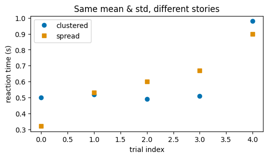
As you can see, the plot from the datasets that gave same stats reveals two different trends.
The lesson: plot your data while you start building intuition from your data. Exploration is not optional polish; it is an indispensable part of data analysis.
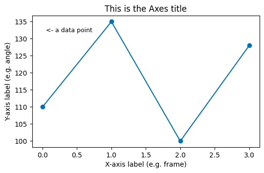
1.2. Concept: The Figure / Axes Mental Model
Almost all confusion with matplotlib disappears once you hold this picture:
A Figure is the whole canvas — the window or image file.
An Axes is a single plot inside that figure (the box with x- and y-axes). A figure can hold several Axes side by side.
The clean, modern way to start is fig, ax = plt.subplots(). You then call methods on ax to draw and label: ax.plot(...), ax.set_xlabel(...), ax.set_title(...). This “explicit” style scales smoothly from one plot to many.
Key Characteristics:
fig, ax = plt.subplots()creates one figure with one Axes.plt.subplots(nrows, ncols)returns a grid of Axes for small multiples (Section 3.3).figsize=(width, height)is in inches.End an exploratory cell with
plt.show()to render the figure.
# The anatomy of a figure, labelled.
fig, ax = plt.subplots(figsize=(6, 3.5))
ax.plot([0, 1, 2, 3], [110, 135, 100, 128], marker="o")
ax.set_title("This is the Axes title")
ax.set_xlabel("X-axis label (e.g. frame)")
ax.set_ylabel("Y-axis label (e.g. angle)")
ax.text(0.05, 132, "<- a data point", fontsize=9)
plt.show()
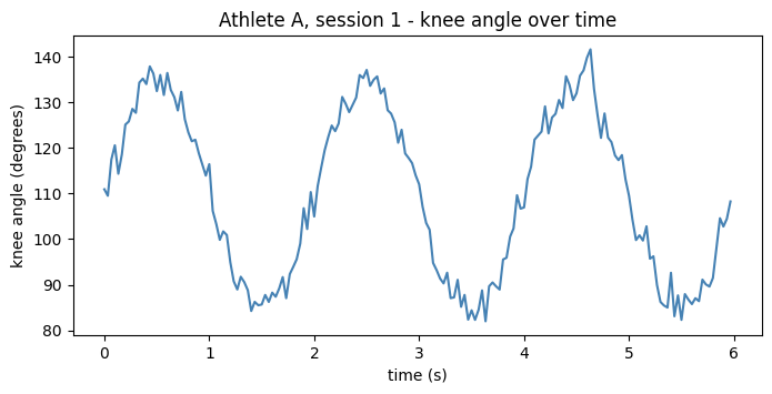
1.3. Your First Research Plot: An Angle Over Time
A line plot is the natural choice when the x-axis is time (or frames) and you want to see how a signal evolves. Let us plot one athlete’s knee angle across one session.
# Pull a single athlete + session out of the tidy DataFrame.
one = df[(df["athlete"] == "A") & (df["session"] == 1)]

fig, ax = plt.subplots(figsize=(8, 3.5))
ax.plot(one["time_s"], one["knee_angle"], color="steelblue", linewidth=1.5)
ax.set_xlabel("time (s)")
ax.set_ylabel("knee angle (degrees)")
ax.set_title("Athlete A, session 1 - knee angle over time")
plt.show()
Mini Challenge 1.3. Plot athlete A’s elbow angle on the same time axis. Then try plotting both knee and elbow on one Axes with two
ax.plot(...)calls and a legend.
Section 2: Core Plot Types for Behavioral Data
Five plot types cover the vast majority of research figures. For each, the key skill is matching the plot to the question.
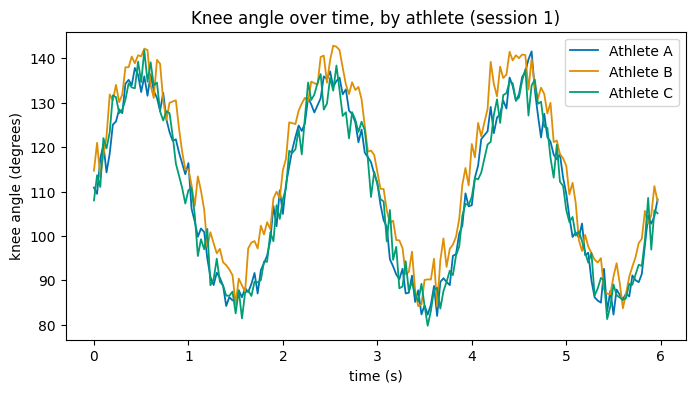
2.1. Line Plots & Time Series — “how does it change over time?”
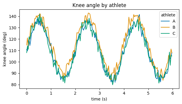
To compare several athletes, draw one line per athlete on the same Axes. A for loop over groups keeps the code short and readable.
fig, ax = plt.subplots(figsize=(8, 4))

# One line per athlete, session 1 only.
for athlete, g in df[df["session"] == 1].groupby("athlete"):
    ax.plot(g["time_s"], g["knee_angle"], label=f"Athlete {athlete}", linewidth=1.3)

ax.set_xlabel("time (s)")
ax.set_ylabel("knee angle (degrees)")
ax.set_title("Knee angle over time, by athlete (session 1)")
ax.legend()
plt.show()
2.2. Scatter Plots & Relationships — “do two measures move together?”
A scatter plot puts one variable on each axis, one dot per observation. It is how you see whether two measures are related. The correlation coefficient r (from np.corrcoef) summarises that relationship in one number from -1 to +1.
fig, ax = plt.subplots(figsize=(5, 5))
ax.scatter(df["knee_angle"], df["elbow_angle"], s=8, alpha=0.3, color="darkorange")
ax.set_xlabel("knee angle (degrees)")
ax.set_ylabel("elbow angle (degrees)")

# Correlation: corrcoef returns a 2x2 matrix; the off-diagonal [0,1] is r.
r = np.corrcoef(df["knee_angle"], df["elbow_angle"])[0, 1]
ax.set_title(f"Knee vs. elbow angle  (r = {r:.2f})")
plt.show()
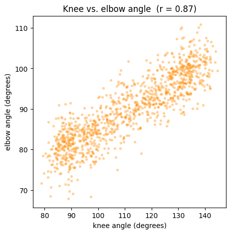
alpha=0.3makes the dots semi-transparent so that overlapping points show up as darker regions — a simple trick for dense data.
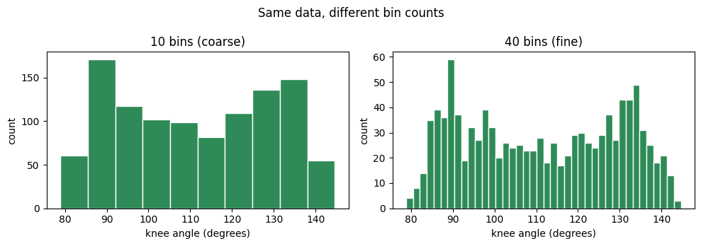
2.3. Distributions: Histograms — “what values are common?”
A histogram sorts values into bins and shows how many fall in each. It reveals the shape of a variable: where it centres, how spread out it is, whether it is skewed or has two peaks. The number of bins is a judgement call — too few hides structure, too many turns it into noise.
fig, axes = plt.subplots(1, 2, figsize=(10, 3.5))

axes[0].hist(df["knee_angle"], bins=10, color="seagreen", edgecolor="white")
axes[0].set_title("10 bins (coarse)")

axes[1].hist(df["knee_angle"], bins=40, color="seagreen", edgecolor="white")
axes[1].set_title("40 bins (fine)")

for ax in axes:
    ax.set_xlabel("knee angle (degrees)"); ax.set_ylabel("count")
fig.suptitle("Same data, different bin counts")
plt.tight_layout()
plt.show()
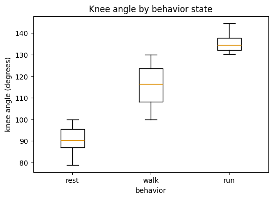
2.4. Boxplots: Comparing Groups — “how do conditions differ?”
A boxplot summarises a distribution as a box (the middle 50% of the data), a line (the median), whiskers (the range), and dots (outliers). Lining up one box per group makes differences between conditions jump out.
# Distribution of knee angle within each behaviour state.
states = ["rest", "walk", "run"]
data_by_state = [df[df["behavior"] == s]["knee_angle"] for s in states]

fig, ax = plt.subplots(figsize=(6, 4))
ax.boxplot(data_by_state, labels=states)
ax.set_xlabel("behavior")
ax.set_ylabel("knee angle (degrees)")
ax.set_title("Knee angle by behavior state")
plt.show()
/var/folders/xl/3brx3y1d71n15p4qb7psl0580000gq/T/ipykernel_8968/1080852975.py:6: MatplotlibDeprecationWarning: The 'labels' parameter of boxplot() has been renamed 'tick_labels' since Matplotlib 3.9; support for the old name will be dropped in 3.11.
  ax.boxplot(data_by_state, labels=states)
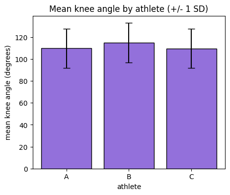
2.5. Bar Plots: Group Means with Error Bars — “which group scored higher?”
A bar plot compares a single summary number (often a mean) across groups. Always pair the bar with an error bar (here, the standard deviation) so the reader can see the spread, not just the average — a bar alone can be misleading.
# Mean knee angle per athlete, with standard deviation as the error bar.
means = df.groupby("athlete")["knee_angle"].mean()
stds  = df.groupby("athlete")["knee_angle"].std()

fig, ax = plt.subplots(figsize=(5, 4))
ax.bar(means.index, means.values, yerr=stds.values,
       capsize=5, color="mediumpurple", edgecolor="black")
ax.set_xlabel("athlete")
ax.set_ylabel("mean knee angle (degrees)")
ax.set_title("Mean knee angle by athlete (+/- 1 SD)")
plt.show()
Checkpoint 2. For each of the five plot types, say the question it answers in a few words: line = change over time, scatter = relationship, histogram = distribution shape, boxplot = compare distributions across groups, bar = compare a single number across groups. Matching plot to question is the whole game.
Section 3: Faster & Prettier — pandas .plot() and seaborn
Everything so far was pure matplotlib, so you understand what is happening underneath. Now we meet two shortcuts that produce nicer plots with far less code.
3.1. One-Line Plots Straight from a DataFrame
pandas DataFrames and Series carry a built-in .plot() method that calls matplotlib for you. It is perfect for a quick look during exploration.
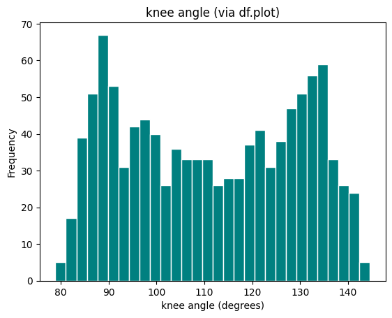
# A Series knows how to plot itself. Same histogram as 2.3, in one line.
df["knee_angle"].plot(kind="hist", bins=30, title="knee angle (via df.plot)",
                      color="teal", edgecolor="white")
plt.xlabel("knee angle (degrees)")
plt.show()
3.2. Concept: seaborn for Statistical Plots
seaborn is built on matplotlib but designed for statistical plots of tidy DataFrames. Its big idea: you pass the whole DataFrame plus the column names for x, y, and hue (the grouping colour), and seaborn handles the splitting, colouring, and legend automatically.
Key Characteristics:
You name columns (
x="time_s"), you do not pre-slice the data.hue="athlete"automatically draws and colours one group per athlete and builds the legend.It assumes tidy data (one row per observation) — exactly the shape we built in Section 0.
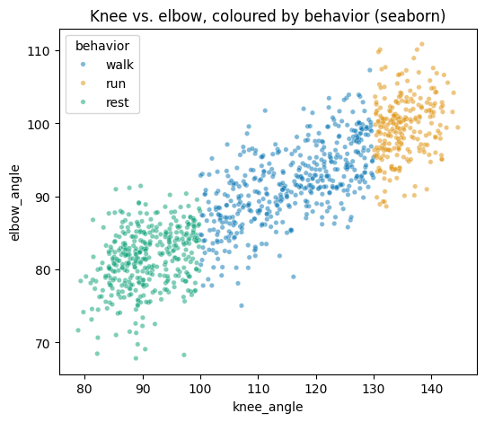
# A seaborn scatter, coloured by behaviour, in a single call.
fig, ax = plt.subplots(figsize=(6, 5))
sns.scatterplot(data=df, x="knee_angle", y="elbow_angle",
                hue="behavior", alpha=0.5, s=15, ax=ax)
ax.set_title("Knee vs. elbow, coloured by behavior (seaborn)")
plt.show()
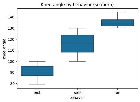
# Compare the boxplot from 2.4 -- seaborn needs just one line and adds colour.
fig, ax = plt.subplots(figsize=(6, 4))
sns.boxplot(data=df, x="behavior", y="knee_angle",
            order=["rest", "walk", "run"], ax=ax)
ax.set_title("Knee angle by behavior (seaborn)")
plt.show()
3.3. Small Multiples (Faceting)
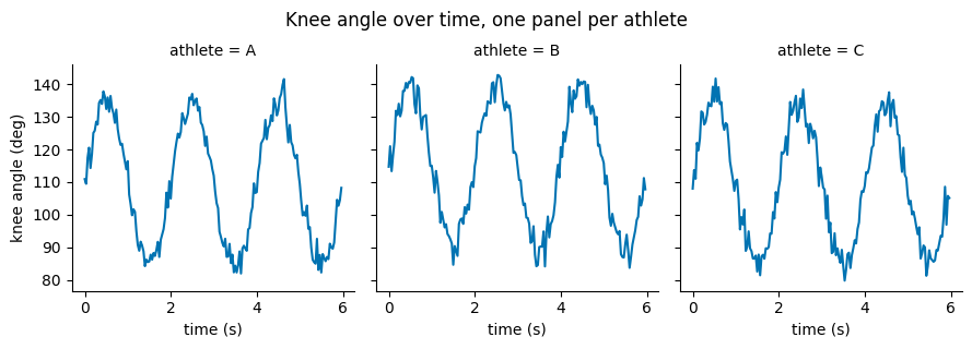
When you want the same plot repeated for each group, seaborn’s faceting draws a grid automatically. sns.relplot(..., col="athlete") makes one panel per athlete. Comparing panels side by side is often clearer than cramming everything onto one Axes.
# One time-series panel per athlete, session 1. height/aspect control panel size.
g = sns.relplot(data=df[df["session"] == 1], x="time_s", y="knee_angle",
                col="athlete", kind="line", height=3, aspect=1.0)
g.set_axis_labels("time (s)", "knee angle (deg)")
g.figure.suptitle("Knee angle over time, one panel per athlete", y=1.05)
plt.show()
Mini Challenge 3. Recreate the seaborn scatter in 3.2 but facet it with
col="athlete"so each athlete gets their own panel. Which athlete shows the tightest knee-elbow relationship?
Section 4: Visualizing Behavior Specifically
Three figures you will reach for again and again when the subject itself is behaviour.
4.1. The Ethogram (Behavior Timeline)
An ethogram is the behavioural scientist’s signature plot: a timeline showing which discrete behaviour an individual is performing at each moment. It turns a column of labels (rest, walk, run) into an instantly readable band of colour over time — perfect for spotting how long behaviours last and how they alternate.
We build it by coding each behaviour as an integer and drawing the sequence as a coloured strip with imshow.
from matplotlib.colors import ListedColormap
from matplotlib.patches import Patch

states = ["rest", "walk", "run"]
state_to_int = {s: i for i, s in enumerate(states)}     # rest->0, walk->1, run->2
colors = ["#cccccc", "#4c9be8", "#e8534c"]              # grey, blue, red
cmap = ListedColormap(colors)

fig, axes = plt.subplots(3, 1, figsize=(9, 3.5), sharex=True)
for ax, athlete in zip(axes, ["A", "B", "C"]):
    seq = df[(df["athlete"] == athlete) & (df["session"] == 1)]
    coded = seq["behavior"].map(state_to_int).to_numpy().reshape(1, -1)   # 1 x frames
    ax.imshow(coded, aspect="auto", cmap=cmap, vmin=0, vmax=2,
              extent=[seq["time_s"].min(), seq["time_s"].max(), 0, 1])
    ax.set_yticks([]); ax.set_ylabel(f"Ath {athlete}", rotation=0, labelpad=18, va="center")

axes[-1].set_xlabel("time (s)")
legend = [Patch(facecolor=c, label=s) for c, s in zip(colors, states)]
axes[0].legend(handles=legend, ncol=3, bbox_to_anchor=(1.0, 1.8), loc="upper right")
fig.suptitle("Ethogram - behaviour over time (session 1)", y=1.02)
plt.tight_layout()
plt.show()
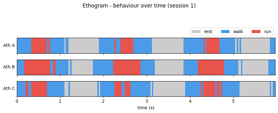
Read each strip left to right: a glance tells you that the athletes cycle between rest, walk, and run, and roughly how much time each spends running. That is the power of an ethogram.
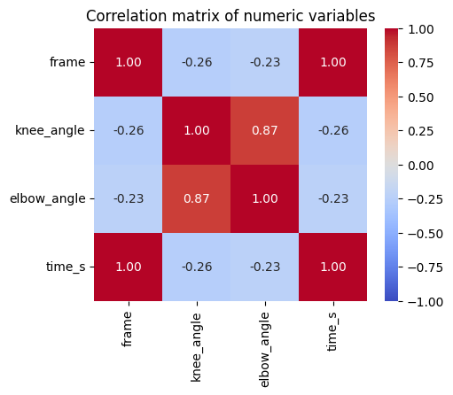
4.2. Heatmaps — “which variables relate to which?”
A heatmap colours the cells of a matrix by value. A common use is a correlation matrix: every pair of numeric variables, coloured by how strongly they correlate. seaborn’s heatmap with annot=True writes the numbers in too.
corr = df[["frame", "knee_angle", "elbow_angle", "time_s"]].corr()

fig, ax = plt.subplots(figsize=(5, 4))
sns.heatmap(corr, annot=True, fmt=".2f", cmap="coolwarm",
            vmin=-1, vmax=1, square=True, ax=ax)
ax.set_title("Correlation matrix of numeric variables")
plt.show()
4.3. A Peek at Interactive Plotly
Sometimes you want to hover over a point to read its exact values, or zoom into a busy time series. Plotly makes interactive figures with very little code. plotly.express (imported as px) mirrors the seaborn style: pass the DataFrame and column names.
Run the cell and hover over the line — each point shows the frame and angle. (This is a light taste; matplotlib and seaborn remain your everyday tools.)
import plotly.express as px

one = df[(df["athlete"] == "A") & (df["session"] == 1)]
fig = px.line(one, x="time_s", y="knee_angle",
              title="Interactive knee angle (hover and zoom)",
              labels={"time_s": "time (s)", "knee_angle": "knee angle (deg)"})
fig.update_layout(height=350)
fig            # displaying the figure object renders it interactively in Jupyter
Section 5: Making Figures Publication-Ready
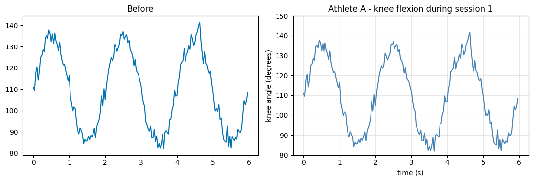
An exploratory plot is for you; a communication plot is for your reader. The difference is almost always labels, colour, and resolution.
5.1. Labels, Titles, Legends, Ticks — the non-negotiables
A figure a stranger cannot read is not finished. Every plot you share should have: axis labels with units, an informative title, a legend if there is more than one series, and readable tick marks. Here is the same line plot, before and after.
one = df[(df["athlete"] == "A") & (df["session"] == 1)]
fig, axes = plt.subplots(1, 2, figsize=(11, 3.8))

# BEFORE: technically a plot, but uncommunicative.
axes[0].plot(one["time_s"], one["knee_angle"])
axes[0].set_title("Before")

# AFTER: labelled, titled, sensible limits, a grid for reading values.
axes[1].plot(one["time_s"], one["knee_angle"], color="steelblue", linewidth=1.5)
axes[1].set_xlabel("time (s)")
axes[1].set_ylabel("knee angle (degrees)")
axes[1].set_title("Athlete A - knee flexion during session 1")
axes[1].set_ylim(80, 150)
axes[1].grid(True, alpha=0.3)
plt.tight_layout()
plt.show()
5.2. Concept: Color & Accessibility
Colour carries meaning, so choose it deliberately:
Categorical data (athlete, behaviour) needs distinct colours — use a qualitative palette.
Ordered/continuous data (a value from low to high) needs a sequential palette where lightness tracks the value.
Roughly 1 in 12 men has some colour-vision deficiency, so prefer colorblind-safe palettes and never rely on red-vs-green alone. seaborn ships a ready-made
"colorblind"palette.
# seaborn's colorblind-safe qualitative palette, applied globally.
sns.set_palette("colorblind")

fig, ax = plt.subplots(figsize=(7, 4))
sns.lineplot(data=df[df["session"] == 1], x="time_s", y="knee_angle",
             hue="athlete", ax=ax)
ax.set_xlabel("time (s)"); ax.set_ylabel("knee angle (deg)")
ax.set_title("Colorblind-safe palette for categorical groups")
plt.show()

# Preview the palette itself.
print("colorblind palette (hex):")
print(sns.color_palette("colorblind").as_hex())
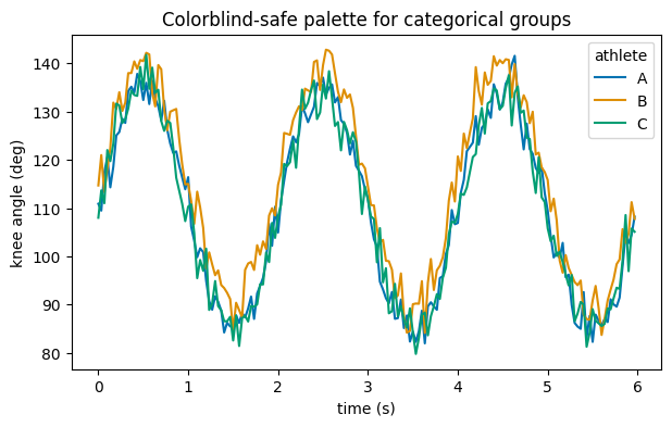
colorblind palette (hex):
['#0173b2', '#de8f05', '#029e73', '#d55e00', '#cc78bc', '#ca9161', '#fbafe4', '#949494', '#ece133', '#56b4e9']
5.3. Saving Figures for Reports
To put a figure in a report, save it with fig.savefig(...). Two arguments matter most:
dpi— dots per inch; 300 is the standard for crisp print/figures.bbox_inches="tight"— trims surrounding whitespace.
Save as PNG for documents and slides; save as PDF or SVG when you need infinitely scalable vector graphics.
fig, ax = plt.subplots(figsize=(7, 3.5))
sns.lineplot(data=df[df["session"] == 1], x="time_s", y="knee_angle",
             hue="athlete", ax=ax)
ax.set_xlabel("time (s)"); ax.set_ylabel("knee angle (deg)")
ax.set_title("Knee angle by athlete")

# Save a high-resolution copy next to this notebook.
fig.savefig("example_figure.png", dpi=300, bbox_inches="tight")
# fig.savefig("example_figure.pdf", bbox_inches="tight")   # vector version
print("Saved 'example_figure.png' (300 dpi).")
plt.show()
Saved 'example_figure.png' (300 dpi).
Section 6: Bridge + Weekly Challenge
You can now turn a table of numbers into a figure that shows something — a trend, a difference, an outlier, a behavioural timeline. Two of those are worth holding onto:
The outliers and patterns a plot reveals are exactly what you will later quantify with statistics (Notebook on mixed-effects models). Plotting first tells you which test even makes sense.
Real recordings are large — hundreds of thousands of frames. Drawing and summarising them efficiently is where the computational thinking of Notebook 04 pays off.
Weekly Challenge. Using
df(or a dataset of your own), build a single figure with three panels that tells one story about an athlete:
a time series of knee angle (Section 2.1),
a histogram of that same angle (Section 2.3), and
an ethogram of the behaviour over the same window (Section 4.1).
Use
fig, axes = plt.subplots(3, 1, ...), label every axis with units, apply a colorblind-safe palette, and save the result at 300 dpi. Aim for a figure a classmate could understand with no explanation from you — that is the real test of a good visualization.
End of Notebook 03. Next: Notebook 04 - Computational Thinking: Data Structures, Algorithms & Fluency, where we make the processing behind these figures fast and clean.